Designing a holistic mobile app experience for IKEA’s staff to educate and raises awareness on IKEA’s store waste reduction and recycling practices.
| Location: | Timeline | Tools | Deliverables |
| Australia, Sydney | Oct ‘20 – Dec ‘20 | Zoom, Whimsical, Miro, Adobe XD and Useberry | User Interview, Usability Testing, Mockup, Low-fidelity Prototype, High-fidelity prototype, and Heuristics evaluation. |

This freelance project with Ikea Sydney Australia span 3 months. The main goal of this project was to design a digital experience for IKEA workers that educates and raises awareness on IKEA’s store waste reduction and recycling practices.
OVERVIEW
Today, IKEA’s overall ambition is to become people and planet positive and to inspire and enable many people to live a better everyday life within the limits of the planet. To do this, IKEA is transforming into a circular business. The circular economy is a new way of looking at the relationship between consumers, products and the companies that create them.
Instead of a linear ‘take-make-dispose model where vast amounts of man-made and natural resources end up in landfills, the circular economy provides a new challenge: how can products be adapted for longevity? What parts can be replaced or repaired? What elements of a product can be recycled, or manufactured from recycled materials? Can the product be reimagined or re-engineered for additional uses? Can it be refurbished or resold?

On top of that IKEA globally have sustainability ambitions for 2030 to be able to achieve design for all of their products to be 100% circular, and aiming to use only renewable or recycled materials. IKEA Australia has been able to reach only 85% of its target and is looking into tackle the 15% of waste that is currently going to landfill.
SCOPE
IKEA’s goal is to have 100% of waste created in-store, to be recycled in the appropriate ways. Staff members need the right information on hand to ensure they make the correct recycling decisions with the various waste products generated in-store. A product that provided a digital experience for current IKEA staff members was needed to help educate and raises awareness on IKEA’s store waste reduction and recycling practices.
USER RESEARCH
To understand the background problem better, I sat down with Bhumika from IKEA Sydney whose role is as Australia Country Sustainability Business Partner where she coordinates multiple states together and pools their resources. I gathered four main points from her,
1. Problems that IKEA Australia was facing
2. Their current practices
3. Staff training
4. Possible solutions that IKEA Australia has so far come up
I conducted desk research on the internet to find out more about IKEA 2030 sustainability ambitions and I requested that Bhumika send me documents and contextual images to assist me in my understanding better. I also managed to get in contact with an IKEA worker in the Sydney Rhodes Branch to do an interview with me, for my user interview and assumption testing.

KEY INSIGHTS
The user research was most helpful in basically putting together a list of things the proposed product needed to do. Many things were raised in the requirement gathering including but not limited to: –
- No consistency approach in Australia, states differ with different laws, waste is not sorted accordingly
- Internal staff knowledge, no incentives for workers and are not seeing the bigger picture
- Staff can misplace the wrong material in the wrong bin
- Bins differ in different stores and states
- The result of takeaway food in-store occurrence of waste has increased
- No infrastructure to support certain materials to be recycled
HOW MIGHT WE?
After defining the identified problem statements, I frame the insights statements as How Might We questions to turn those challenges into opportunities for design. For each problem, I wrote a tentative solution then started combining these solutions with each other. The solutions started to link up to each other before I fine-tune the pages needed.
“How might we create an application that engages and informed IKEA recycling practices for IKEA workers in an intuitive way so that they are well equipped and brief”.
Conclusively, I chose the mobile app experience to be the best platform for users as it was easy for them to carry around.

The four main features of the app includes: –
- Dashboard
- Guide Page
- Gamification Learning Course
- Chatbot Page
LOW – FIDELITY PROTOTYPE & ASSUMPTION TESTING
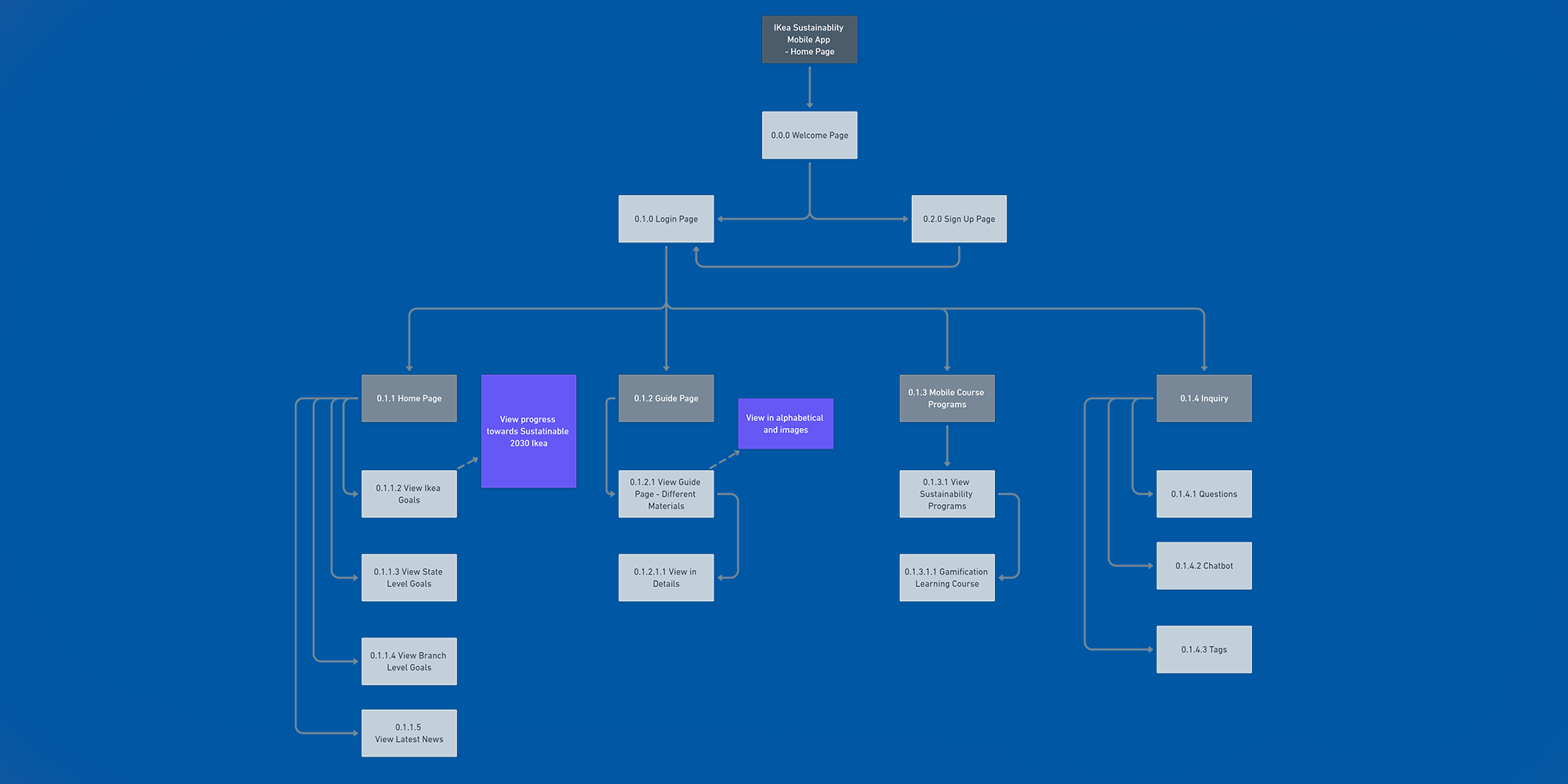
Using Whimsical, I laid out the information architecture structure of the different pages including a rough structure of the layout. I was able to set a time with the IKEA worker in Sydney for a quick interview. During the interview, I reaffirm the problem statements that were brought up to me from my requirement gathering findings and tried to understand her role on the ground. The interview validated all my assumptions and before ending the interview, I took the opportunity to conduct an assumption testing of my low-fidelity prototypes.

HIGH – FIDELITY PROTOTYPE
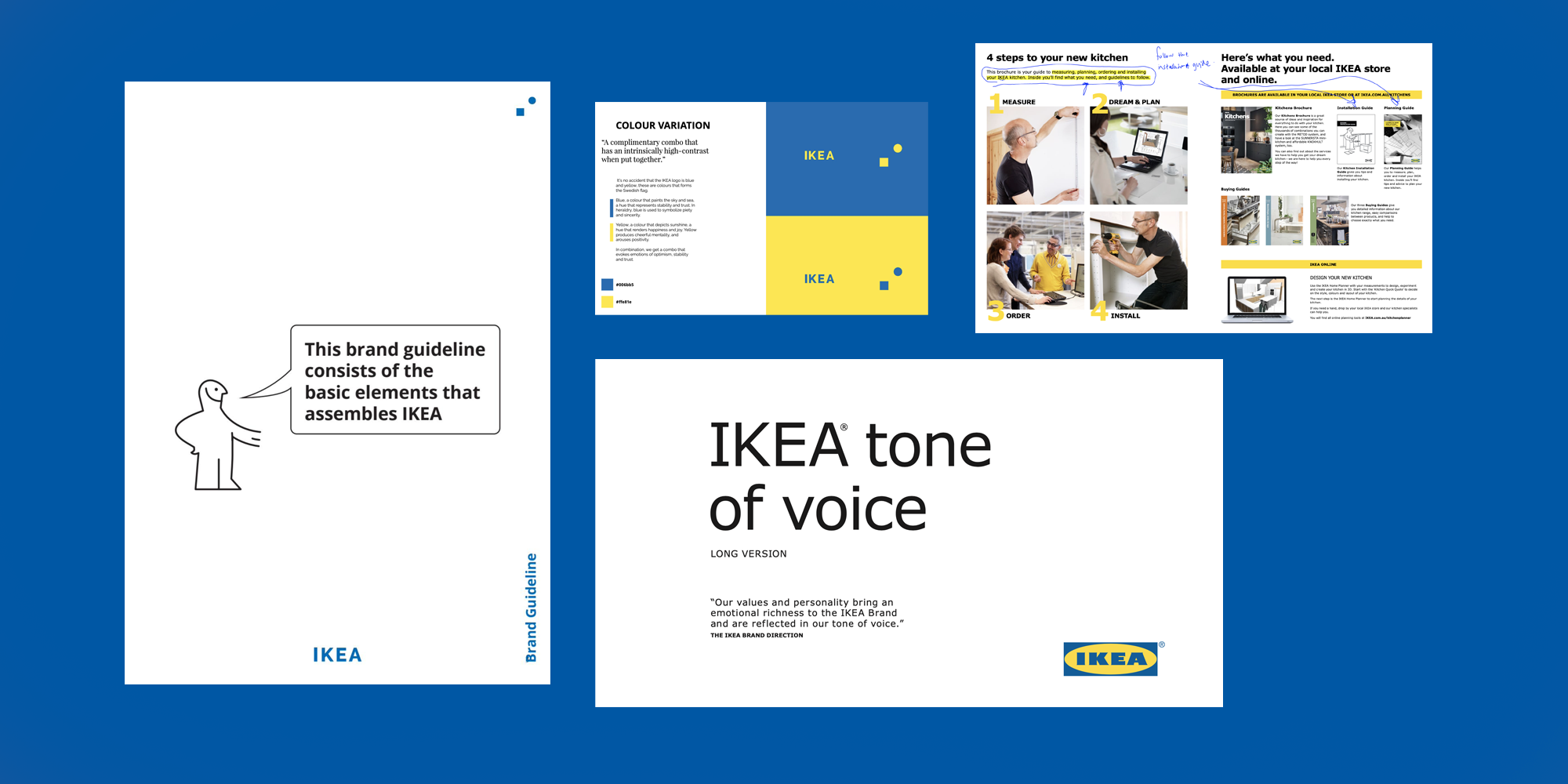
The next phase of the project involves creating high-fidelity prototypes. Using Adobe XD, I followed IKEA’s branding guidelines to copy the colours, fonts and tone of voice over to my prototype.


USABILITY TEST
An unmoderated usability test was conducted with the IKEA worker, and the test was to find out:-
- Does the application make sense to the user?
- Is it easy to navigate around the different pages?
- Design UI feedback
Through the test, I was able to make continuous changes to improve the app and record the user’s feedback noting their likes, feels and suggestions.

I set up an unmoderated usability test on Useberry to collect feedback from multiple users simultaneously. The test objectives I set on Useberry is to see users complete a different task and navigate the app without any guidance. The test was proven success with all users gaining a total of 100% scores in all the tasks. I ended the usability test with an open-ended question to see things from their own perspective.

HANDOFF


